
Mudroom makeover, from dark to light paint
September 30, 2016
Share this
When we moved our laundry to the basement years ago to make this into a mud room, I was so excited to work on it. I had already started the beadboard so that was finished off throughout the space.
I initially went a different direction than usual with a flip flopped look -- dark on bottom and light on top:

I quite liked it for some time. It was different for me and I loved the peacock blue. (It's called Reflecting Pool.) It's a beautiful color!
But I am a classic lover at heart and I was craving a more traditional look in here. Soooo. I decided to paint the entire room, nearly top to bottom. Good idea at the time! :) I'm so thrilled with the result that all the work was worth it.
I started on the trim. So. much. trim. Goodness people. Purdy provided me with some supplies and I was thrilled because these are some of my favorites:

This Purdy angle brush was so helpful as I worked on the room. An angled brush is a must when painting trim and cutting in at ceilings. It makes the job so much easier!
I have always loved how much paint these brushes hold and how nicely the paint goes on:

Then it was time to start the beadboard. I was dreading this part -- in the past I've used a roller and then had to use my brush to get in between the "beads" in the board.
I used this roller was super thick and lush (it was a 3/8 inch nap) and I literally uttered a "hallelujah" out loud when I first rolled it on. It holds so much paint, I was able to fill in about 90 percent of the gaps with just the roller. This saved me SO much time -- I was thrilled. I only had to go back over a few spots with the brush to fill in spots that the roller didn't get.
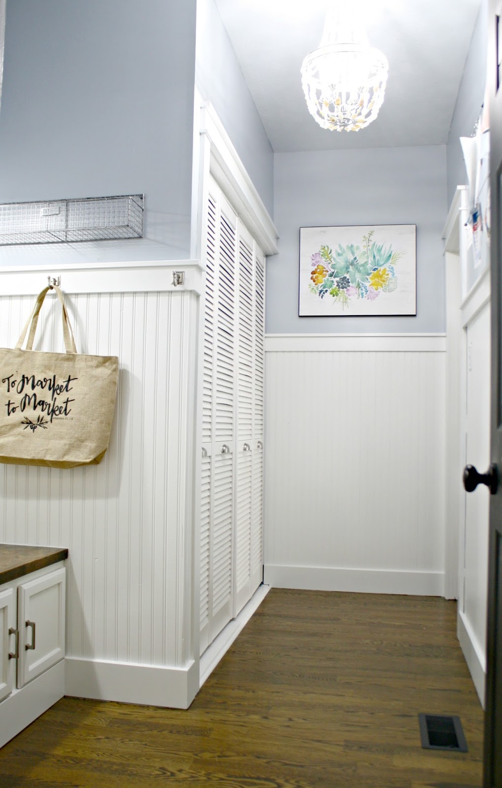
The white color is called Pure White (the code for this color is HGSW4006) and I use it all over our house. I use the semi-gloss sheen for our trim and wall treatments. It was coming along nicely:

Do you see my vision coming to life? I love when it starts to come together! :)
Next up was the wall paint -- I chose Krypton from HGTV HOME by Sherwin-Williams (the code for this color is HGSW3366 and it's the Perfectly Polished Color Collection) in satin.
Krypton is a pretty blue color that leans a little bit gray. I used the angled brush again to cut in:

It takes some practice to get the hang of cutting in but it's worth learning! It will save you a ton of time taping off trim and ceilings. An angled brush like this one is the best for cutting in because it allows you to push the brush right up against the trim -- the angle gives you nice control.
I love the Purdy brushes and rollers but my favorite item is their brush comb -- I love it!:

I've used one for years and it saves me hundreds of dollars in new brushes. You use it to clean out the brush and it really does a great job of getting the gunk out. They will stay nicer for much longer with this tool. I clean it with the comb, squeeze out the excess water and then comb through it a few more times. The shape stays looking like new when I take this extra step.
This room is SO pretty now and so much more "our house":

I liked trying something different and didn't mind it for years. But the classic bright white trim won out. I am a white trim kind of girl, even when I try to fight it. :)
What I love most about both colors is that they go so well with everything. I'm finding blue really is great neutral, believe it or not. It goes with just about any accent color:

I simplified the pillows in here -- we had a couple off to the side and we never used that side. :)
This lumbar pillow offers some color and comfort but doesn't get in the way:

Do you see the hint of fall on the wall? I shared Rachel's beautiful fall printable last year and thought it would look so lovely in here. :) When I finish the shelving above the bench I'll be adding more art in here as well.
I shared our command station (from IKEA) last year and it's been awesome in here:

It's a great spot for school papers or reminders. I didn't take it down to paint by the way -- I just taped off and painted around it. :)
So I've always hated those utility doors and now I've figured out why. The dark paint made them stand out even more. Now? I don't mind them at all because they blend in:

I'd never thought I'd say it but I kind of like them now. Who knew?
I have a couple more updates to make to this room -- shelving above the bench will go up to the ceiling and then crown molding will go around the whole room. THEN this room will be done and I will be so very happy. Well, I'm already happy. But extra.
I've experimented with storage over the years and have actually removed more and more over time. I only have this wire basket still hanging:

I use it for stuff that needs to go out to the car (I emptied it out for pics). I found when I had baskets on the bench they just filled up with stuff and it annoyed me. :) The shelving above will hold baskets and those will store random items that need a spot around the house. They will be higher and won't be something we'll access every day.
I have to mention that we were both shocked at how much brighter the room got when the beadboard went white. I know, it's not surprising that would happen, but the difference was so noticeable. I mean, the walls were white before -- it was that dark blue that was sucking all the light from the room. We love the change.
I also changed out all of the bulbs to daylight LEDs. I told you about those in this post and I've changed out the bulbs in all rooms without natural light. They make a BIG difference in how a room feels (no yellow tint):

I still like a warmer tone for most rooms in our house, but darker rooms look like new spaces with just the bulbs.
Here are some of the before and after pics which really show the difference some paint makes. First up, the bench:

You know I love contrast! I was going for that with the dark trim, but I much prefer the white trim and dark floors instead:

Our mud room is actually quite large, but most of it is this long area by the closet:

See how the old bulbs made the white walls look yellow? With no natural light that's what happens with incandescents. That blue really was lovely -- it's a beautiful color! I just didn't mesh with the rest of our house and I was ready for a change.
The after is so much brighter and welcoming!:
Full disclosure -- I opened the door to our garage and climbed on to the hood of my car to take this photo. Ha!
Let's go way back to the yellow and black laundry room. This is a real life look back:

This is how it looked most days. It drove crazy to have the laundry right by the door.
The new colors are like taking a deep breath. They feel so right in our house:

Big change right? Have you tried dark trim in your home? I've seen it done beautifully but all one color was too much for me after time. This still gives me a bit of contrast but with lighter colors.
Wow that looks really good! The white beadboard makes the room look soooo much bigger than the peacock!!
ReplyDeleteIsn't it crazy how much bigger it feels? We noticed it immediately.
DeleteIt really does look better. I loved the dark before, but this is awesome.
ReplyDeleteWhere did you get the "EXIT" sign? I love it! :)
ReplyDeleteMe too! It was from HomeGoods. :)
DeleteLook what I found! http://www.signaturehardware.com/solid-brass-exit-sign.html
DeleteIt looks SO beautiful! I love the bright white trim and the new blue color! I loved the peacock color, but I have to agree, the new colors make it so much brighter and bigger!
ReplyDeleteI just got Sherwin Williams Whole wheat for my front and back entry ways. did you use 2 colors for yours? thanks..
ReplyDeleteYour mud room looks great! It's a lot brighter now. Love the bench and glad you left the top stained so you can see the wood grain. Nice job!
ReplyDeleteI'm using the HGTV Showcase paint (color Red Tanager) for the interior doors in our cabin. I really like how the semi-gloss feels when it's dry- and it dries fast!
ReplyDeleteI've been thinking of using those same barn lights next to our front door. Can you tell me how high you hung them? I was concerned the light would be glaringly bright if I hung them too high.
Girl, you've been BUSY!! I'm starting to feel like a slacker over here, seeing all of your projects. Love the classics - so fresh and pretty!
ReplyDeletelove it! it's really so bright now!
ReplyDeleteI didn't dislike the blue beadboard, but never felt like it fit with the rest of your house. I LOVE the white beadboard, the room definitely looks so much bigger and brighter. =)
ReplyDeleteBeautiful transformation! I let out a little squeal when I saw you used Krypton! Love that color!
ReplyDeleteWow! Such a huge transformation! I love how the wood floor/bench really stands out now.
ReplyDeleteI LOVE the white bead board. It's classic in the best possible way :)
ReplyDeleteWhat a beautiful transformation... just love the blue and white....Will have to check out the Krypton as it reminds me of the SW Silvermist I use in my home..such a bright and cheerful mudroom! Love it!
ReplyDeleteWe painted our kitchen Krypton this summer and I love the color! It looks great with our white cabinets and trim!
ReplyDeleteLooks fantastic, I love that Lowes now carries HGTV paints.. Have been painting all year with it.. It is fantastic.
ReplyDeleteWell, Sarah, the change is phenomenal. It's beautiful, light and bright...and so welcoming. The entry lets visitors know right away what a happy home this is. P.S. I love the lumbar pillow on the bench. Can you tell us where you got it? Thank you and cheers, Ardith
ReplyDeleteIt looks very nice! I wonder what it would have looked like whitewashed so a shadow of the blue showed through.
ReplyDeleteThis was such a great update! I totally get wanting to try something outside the norm, but this white beadboard and trim seems like a better match for the rest of your home and it seems so much more spacious!
ReplyDeleteWOW! What a difference ~ I love it. I'll have to look for that Purdy comb. Kewel
ReplyDeleteI love the new colors! So fresh and clean. I love that floral art on the back wall, do you mind sharing where its from?
ReplyDeleteLove the Krypton and the white! Beautiful! What is the color of the door? It coordinates so well. Also, love the flooring- can you provide the details on that too, please?
ReplyDelete